

Think different when designing your Intranet
Designing an intranet can be a daunting task, you need to strike a balance between expressing your company’s internal brand and maintaining ease of use for employees.
Often design ideas start out mimicking a public facing website because, why not? You have this beautifully designed website that everyone loves so it must be a perfect fit for your internal Intranet. The premise of this thinking isn't wrong, as some best practises for web design stay consistent between all internet projects. The differentiating factor, however, is that your external website has very different goals then your internal Intranet.
When you look at your external website the goal is to differentiate yourself from the competition and to tell a story about your brand. Whereas your intranet is focused on communicating important information to your employees. This doesn't mean that one is beautifully designed, and the other isn't, it just changes the focus of the design. An intranet needs to be able to break down large amounts of information into digestible chunks on a page for ease of use and readability.
Let’s Take a look at 2 examples of companies that have award winning intranets and the differences that have compared to their public site.
Example 1: 3M Company Intranet
Intranet:
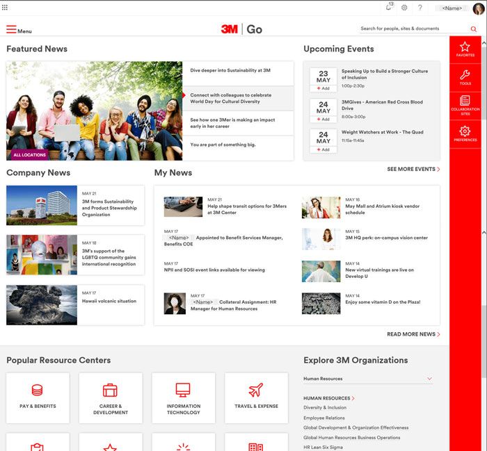.jpg "blog-intranet-3m-intranet.jpg")
We can see that the Intranet uses the 3M red and same font to make sure the brand feels consistent to its public website. Their intranet has more of a dashboard feel where outside of the main featured news sections everything has similar hierarchy. The reasoning behind this decision is simple, with an intranet you aren’t trying to draw the user’s eye to one particular place over another. The goal is strictly to present all the info in a straight forward way.
Customization is a central component of most Intranet design. You can see this in the toolbox on the right side of the design. Here employees can pin favourites, quickly access common tools, and set their preferences.
Public facing site:
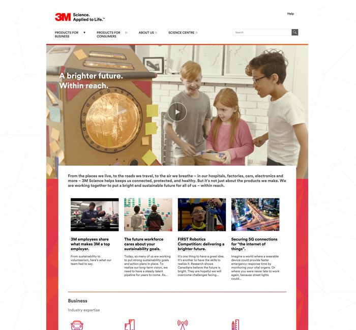.jpg "blog-intranet-3m-homepage.jpg")
We see on the public website it focuses more on telling a story and drawing attention to the big hero image right off the bat. The goal may still be similar in terms of communication but now it’s about communicating stories to consumers that create a unique brand story. Content also has a lot more breathing room and uses more scrolling to visualize the information.
Example 2: Jetblue Airways Intranet
Jetblue's intranet also focuses on customization. You can see this in how the employee's name is front an center. The main focus of this design reflects the search functionality of the navigation bar. They give a lot of real estate to the search function since it’s more common for employees to search for items then navigate using the menu.
The same functionality as 3M can be seen with mentions and operations giving employees the ability to track and manage notifications as well as pin favourites to the operations.
Intranet:
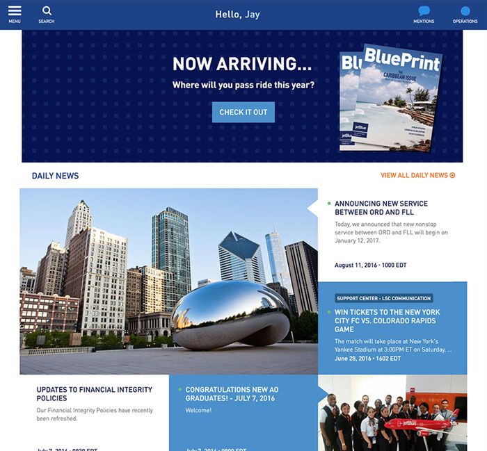.jpg "blog-intranet-jetblue-intranet.jpg")
If we look at their public facing website, you will see some major differences in the functionality and goals of the site. The navigation isn’t hidden in a hamburger menu because users typically like to be able to see all their options up front. They are going to the site for a reason and the less clicks needed the better. The branding is much more playful and prominent on the public site. Giving it a more fun and light feel for consumers who are interacting with it.
You can see that the intranet has pulled similarities from the main site so that they feel like they are part of a family how
Public facing website:
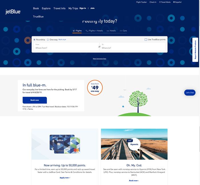.jpg "blog-intranet-jetblue-homepage.jpg")
Intranet Design Best Practise
- Give the intranet the look and feel it needs to meet its goal. Focus in on the ultimate goal of your intranet and use that to dictate all your design decisions going forward.
- Be careful not to make it the design too different from your external brand. Cohesion is important but you don’t want to mimic your public facing website either. Find the right balance by bringing in some similar branding elements like colours and fonts to ensure they feel part of the same company.
- Don't base your design decisions around what a public facing website looks like. Remember that this needs to be simple and clear to ensure ease of use for your employees.
- Keep it simple. Simple doesn't mean that it is not designed, it just means that nothing needs to be flashy and in your face. Successful design falls to the background and almost becomes unnoticeable in its execution.
Reference:
Branding an Intranet
https://www.nngroup.com/articles/branding-intranet/
Best Transportation Sector Intranets 2003 -2018
By Kara Pernice, Amy Schade, Jakob Nielsen, Patty Caya, Mathew Schwartz, and Candice Goodwin
PBL – Sharepoint Intranet Portal
By Umair Khalil
3M Go engages employees and wins two Intranet Awards