In-depth technical examination of 5 great architecture websites
As a web design agency who builds websites for architecture firms, we are accustomed to a comparative analysis of the competition within the industry. While no two websites are the same, there are some metrics that can be used to build a case for what we present to architecture firms. In this blog we will be examining a handful of different architecture websites and break them down by the following metrics:
User Experience: How well does the website reflect user goals? How is information displayed? Does the design make it easy and enjoyable to find what you are looking for?
Mobile Experience: Is the website responsive to different screen sizes? Is information displayed differently on Mobile?
Accessibility: Does the website abide by Accessibility standards? Can screen readers read the website? Can the website be navigated without a mouse? Is, there enough contrasts between colours?
Speed: Is the website optimized for Desktop and Mobile? How fast is the website performance?
Originality: This metric is used to examine what is unique about a website and how it stands out within the context of other websites within the industry.
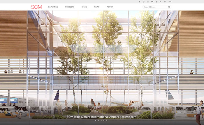
SKIDMORE, OWINGS & MERRILL LLP ARCHITECTS
User Experience: 8
It is hard not to find what you are looking for and navigating the menu or through the “Projects” gallery. Good user experience presents information at the level the user is looking for and does not show information that is irrelevant. You can see this in the way the “Projects” gallery allows you to navigate with filters and explore individual projects from a general to specific way. The only thing we didn’t like when looking at this website is that we wish the menu was sticky when you scroll down and the navigation of the slider on the homepage are too low on the slide making it necessary to scroll down to see them.
Mobile Experience: 10
This website looks better on mobile than it does on Desktop and is responsive to Mobile and Tablet screen sizes. All of these breakpoints are optimized, and the website gracefully adjusts. We especially like the secondary menu solution that displays navigation options as a category option instead of cluttering up the mobile menu.
Accessibility: 10
This website complies with AODA AAA. There is only one page with errors out of a 332 pages and files checked.
Speed: 9
This website gets a rating of 95/100 on Desktop speed and a score of 86/100 on mobile. It doesn’t get much better than this for a website that features large images.
Originality: 5
As much as we like this website we cannot say that it is original. The goal of the design was likely to stay true to user goals and create an easy to use website. This can sometimes lead to a predictable approach to the design which makes for less originality.
Score: 42
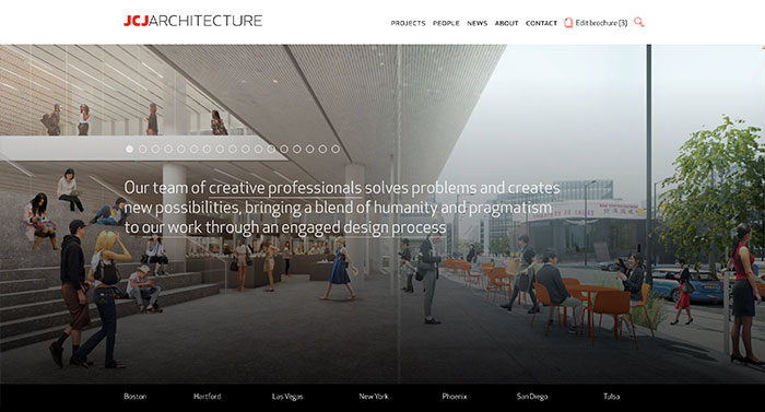
JCJ ARCHITECTURE
https://www.jcj.com/
User Experience: 6
This website has a variety of different navigation options that make navigating the site feel a little inconsistent. The projects page has a full screen red navigation page that is not seen anywhere else. This feels out of place. We do like how they have their filter bar showing on the “News” and “People” pages but find using the bar frustrating because when you click on the filter the page reloads and moves. The site could use a sticky menu so that navigation controls are consistently available to the users. Despite these inconsistencies you can still navigate the site fairly easily and the search page is well done.
Mobile Experience 6
This website is optimized for different devices and is responsive but there is some area for improvement. The first thing you will notice when loading the site on mobile is the odd placement of the ellipses navigation controls on the main slider. They appear too high on the slider and there are too many of them making the site a bit confusing to look at. We like the mobile menu (especially the treatment of the projects) but feel the filter categories are too small and are hard to click.
Accessibility 10
This website complies with AODA AAA. There is only one page with errors out of a 412 pages and files checked.
Speed: 9
This website gets a rating of 95/100 on Desktop speed and a score of 83/100 on mobile. It doesn’t get much better than this for a website that features large images.
Originality: 7
Don’t let the homepage fool you. This website is original but in some ways to the detriment of the user experience. Our favourite aspect of the site is the brochure functionality built in to the projects. The site lets you add and edit any projects together and build a PDF of them. 
Score: 38
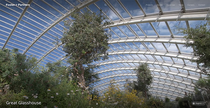
FOSTER + PARTNERS
https://www.fosterandpartners.com/
User Experience: 9
When navigating this website you can tell Forester and Partners want you to experience it in a way that focuses your attention on the project. The menu system is logical easy to follow and appears as a sticky menu when you scroll up on any page. This really works on a site that shows off large images and has scrolling built into the intended experience. We also like the use of whitespace and animation as this gives the user interest in scrolling. This website is proof that you do not have to compromise the user experience for the sake of showing large images and making your website artistic. 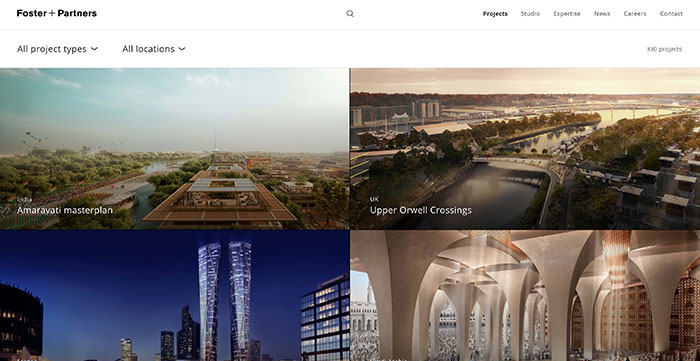
Mobile Experience: 9
This website looks great on mobile devices. They have managed to keep everything consistent by using animations and having the sticky menu appear when you scroll up. It is a really nice touch on mobile devices because screen space is limited.
Accessibility: 10
This website complies with AODA AAA. There is only one page with errors out of a 115 pages and files checked.
Speed 7
This website gets a rating of 91/100 on Desktop speed and a score of 66/100 on mobile. Ideally the website would perform better on mobile but it is clear that the decision is to keep the animations and keep the consistency of the look and feel over get a faster load time.
Originality 9
People often think of originality being something loud and in your face. This website shows the opposite. It is original in its approach to guiding the user through the experience of the work with animating content and menus to reflect the firm’s identity and commitment to paying attention to detail.
Score: 44
MJMA
User Experience 8
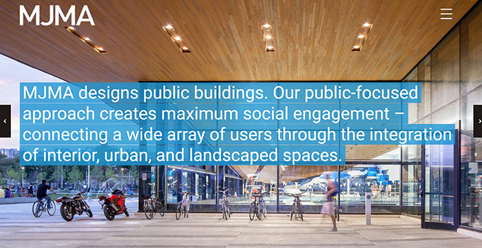
The user experience of this website doesn't rely on gimmicks or flashy elements to stand out. It focuses strictly on the content and ease of use of the site. Making it easy to navigate and find whatever info the user has visited the site for. It uses consistent treatment of its filter and navigation system so that there are never any surprises page to page. Overall its a sound execution of clean UX.
Mobile Experience 10
This website is responsive and is optimized for the major device breakpoints and transitions smoothly between them. The filter system is represented as a separate secondary menu on the page and follows best practice for optimizing a site for mobile experience.
Accessibility: 10
This website complies with AODA AA. There is only one page with errors out of a 208 pages and files checked.
Speed: 9
This website gets a rating of 94/100 on Desktop speed and a score of 85/100 on mobile.
Originality: 5
The focus of this website is to present projects and make it easy for users to find the information that they are looking for. These user goals were prioritized over originality.
Score: 42
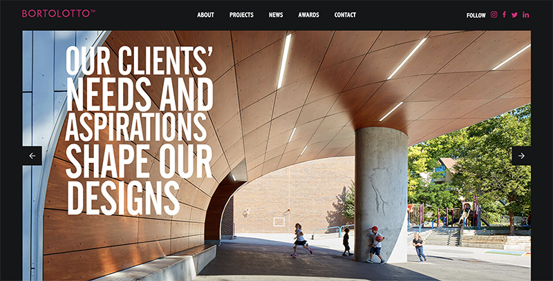
BORTOLOTTO
User Experience 9
This focus of this website is to showcase work with large imagery and intuitive navigation that allows users to easily navigate site content. Balance is achieved by using a lot of white space, reducing font size and large imagery. User Interface controls like the sticky navigation, tabbed filters, as well as related content make this site a great example of well thought out user experience design.
Mobile Experience 8
This website is optimized for all types of devices and is fully responsive. The home page looks excellent on mobile and you can tell a lot of effort was put into making this site work on smaller screen sizes. One area for improvement is the text size. Certain pages the font size is smaller than standard which makes it hard to read.
Accessibility: 6.5
This website is WCAG Level A compliant. There are 6 issues on 19 pages.
Speed: 9
This website gets a rating of 98/100 on desktop and 92/100 on mobile. Great numbers for a site that features large images and galleries.
Originality: 8
Spending time on this site you get a sense for the Bortolotto brand. Clean high contrast design accented with sharp fluorescent pink give the site its unique look. The website does not exactly reinvent the wheel in terms of functionality, but the ease of use combined with creative branding and design give the site an original feel.
Score: 40.5

Alex
Senior Project Manager
Alex Treen is the Senior Project Manager at Inorbital, specializing in member-based solutions. Alex oversees project lifecycles, ensuring timely and budget-conscious delivery of dynamic websites for a diverse clientele. He has over 10 years of experience managing digital projects with a background in Psychology and Web Design.


