Accessibility Guidelines for Content Editors
Web, PDFs, and Documents
Accessibility isn’t optional—it’s foundational. The way content is structured, written, and published directly affects how usable it is for everyone, including people using assistive technologies. This guide outlines the non-negotiables content editors must follow to meet accessibility standards and avoid common pitfalls.
Headings and Content Structure
Headings define the structure of your content—for users and screen readers alike.
Best practices
- Every page must start with a single H1.
- Follow a logical hierarchy from H1 → H6.
- Do not skip heading levels (e.g., H1 to H3) unless you are closing a subsection.
When skipping is acceptable
It’s acceptable for a new section (<h2>) to follow a lower-level heading (e.g., <h4>) only when the lower-level section has ended.
Use headings for structure—not styling. Visual presentation should always be handled with CSS.
![Accessibility Success Guide for Content Editors by Inorbital [1] Accessibility Success Guide for Content Editors by Inorbital [1]](/getContentAsset/3ce26f07-7d0e-4ac3-a533-ed419fc1309f/b4d3e46e-57e0-4abb-b342-3a7bd4d835c5/Accessibility-Success-Guide-for-Content-Editors-by-Inorbital-1.jpg?language=en-CA)
Links: Make Them Clear and Meaningful
Avoid standalone “Read more” or “Learn more”
Links must make sense on their own.
Do this:
Learn more about our accessibility services
If link text can’t be changed:
- Keep the visible text
- Add a descriptive
aria-labelto clarify the destination
Links must not rely on color alone
Users must be able to identify links without color perception.
Choose one:
- Add underline, bolding, or another visual indicator
- Ensure a minimum 3:1 contrast ratio
- Provide clear visual feedback on hover and keyboard focus
Link text must be unique
Multiple links with different destinations cannot share the same accessible name.
If visible text must stay generic:
Use
aria-label,aria-labelledby, ortitleattributes to differentiate links
This is especially critical when multiple “Read more” or “Click here” links appear on the same page.
Images: Always Include Alt Text
Every <img> element must include an alt attribute—without exception.
Decorative images
- Still require
alt="" - Do not omit the attribute
Alt text ensures users who can’t see images still receive the same information.
Videos and Iframes
Required
- Every
<iframe>must include a descriptivetitleattribute
Styling rules
- Remove standalone
width,height, andframeborderattributes - Use CSS instead:
Better yet, apply styles via a CSS class in your stylesheet.
HTML Formatting Rules (Non-Negotiable)
Avoid deprecated or non-semantic tags:
| ❌ Don’t Use | ✅ Use Instead |
|---|---|
<b> or <bold> | <strong> or font-weight:600 |
<center> | text-align:center |
<u> | text-decoration:underline |
Semantic HTML improves screen reader interpretation and long-term maintainability.
PDFs and Documents: Accessibility Starts at the Source
Accessible PDFs begin with accessible source files.
Recommended authoring tools
- Microsoft Word, PowerPoint, Excel
- Adobe InDesign
- OpenOffice
Microsoft Office provides strong built-in accessibility support and continues to improve with each version.
What an accessible document includes
- Proper heading structure
- Alt text for images
- Logical table structure
- Descriptive links
- Lists and columns created using built-in tools
- Legible text size
- Strong color contrast
- No reliance on color alone
- Clear document title
Critical warning
Never use “Print to PDF.”
Doing so strips:
- Heading structure
- Alt text
- Tags required by screen readers
Always use Save as PDF or Export to PDF to preserve accessibility metadata.
Testing Accessibility in Microsoft Word
Use the built-in Accessibility Checker before publishing.
How to run it
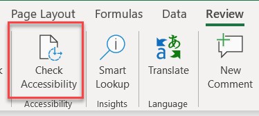
- Open the Review tab
- Select Check Accessibility
- Review errors, warnings, and tips
- Fix issues before exporting
The checker highlights issues and explains how to resolve them.

Common Accessibility Issues (and Why They Matter)
Missing alt text
Alt text ensures users who can’t see visuals still understand the content.
If an image contains text:
- Repeat that text in the document
- Mention its intent in the alt description
Poor link text
Links must clearly describe their destination—especially for screen reader users scanning links out of context.
Avoid: Click here
Use: Download the Accessibility Checklist (PDF)
ScreenTips can also be added to provide additional context on hover.
Color-only meaning
If color alone communicates meaning, some users will miss it entirely.
- Always pair color with text or icons
- Use the Accessibility Checker to identify issues
Insufficient contrast
Low contrast makes content difficult—or impossible—to read.
- Ensure strong contrast between text and background
- Validate using the Accessibility Checker or contrast tools
Improper heading usage
Use built-in heading styles—not manual formatting.
Why it matters:
- Preserves logical reading order
- Maintains keyboard navigation
- Enables efficient screen reader navigation
Complex tables
Avoid:
- Merged cells
- Split cells
- Nested tables
- Empty rows or columns
Use simple structures and define column headers. Validate with the Accessibility Checker.
Further Reading
Microsoft Word Accessibility Guide
https://support.microsoft.com/en-us/office/make-your-word-documents-accessible-to-people-with-disabilities-d9bf3683-87ac-47ea-b91a-78dcacb3c66dAdobe Acrobat Accessibility (WebAIM)
https://webaim.org/techniques/acrobat/acrobat


