Every new project is different and exciting to work on as a UX designer, however there are certain things that come up on every project no matter how unique the project is. Questions that continue to haunt UX designers as we continue to develop our craft and gain better understandings of user behaviours.
In this article we are going to look over some of the biggest questions around what people consider to be good web design and how things have changed over the last number of years for the better. So, without further ado lets jump into things.
Question #1: Do People scroll, and should all the content be visible?
This is one that is heard far too often when designing websites and is a concern of most clients. Which is fair because back in the early days of the internet users weren’t used to scrolling so you would load a page and would be overwhelmed with an aggressive amount of information to ensure that no one would miss all the important things people wanted to display to their users. Thankfully as we have become more tech savvy humans we have learned that it’s better to break up content into digestible chunks and let users scroll down quickly to scan for the information they are looking for.
A study done by Clicktale in Unfolding the insights into webpage scroll shows how on 120,000 page views over a one month period 76% of users scrolled the pages they visited and 22% scrolled all the way to the bottom of the page.

Question #2: We need the site Accessible, will this limit the design possibilities
By 2025 Ontario will make it mandatory for websites to be AODA compliant which means companies should be planning for the future now and designing for AA compliance. With this comes a misconception that to be compliant means to be plain and boring when designing your site. Keeping things black and white to limit any contrast issues. Which was warranted when sites first started to be designed to be accessible.
Sites were being stripped of design in favour of accessibility but as we have continued to develop our understanding and abilities, we’ve also been able to bring back good design into fully accessible sites.
Some great examples are:
https://www.cpso.on.ca/
https://www.apple.com/
https://www.cprs.ca/
Question #3: Can you design the site without any content?
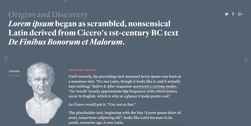
Website design has always been about fast turn around and templated builds that can adapt and grow with various types of content. This means more and more websites are being designed using lorem ipsum and optimal layouts over real content. This method is kind of like putting the cart before the horse, it’s great for moving quickly at the start of a process but eventually catches up with you, down the road, when you have to adapt and re-design elements because of content that wasn’t planned for.
The fact is that users come to websites for the content, not the design. It’s important for it to look good but if the content doesn’t come through in a clear and concise manner it hurts the overall usability of the website.

Question 4: Won’t the user know to click the big flashing button?
Research has shown that users don’t make the optimal choice when browsing through your site. In a perfect world a user would come to your site read the page and accurately navigate through to the information they need to access.
However, we know that users tend to have the mind set of “good enough” when trying to find information on a website. They are okay with quickly clicking links and going back if it’s wrong vs reading thoroughly and navigating only once. It’s easy for a user to use trial and error when browsing since there is no punishment for clicking to the wrong link outside of time lost.
https://www.smashingmagazine.com/2007/10/30-usability-issues-to-be-aware-of/

Question 5: Are we following the 3 Click Rule?
This is a rule that came about in the early stages of UX, everyone had this idea that you needed to be able to navigate to any information within 3 clicks or you would lose the user along the journey. With research we have been able to debunk this myth and learn that the number of clicks it takes doesn’t change the user’s satisfaction with the website. What’s really important is having a logical structure and easy to follow site hierarchy. 10 clicks through a well thought out site hierarchy is better than 3 clicks through a poor one.
https://www.nngroup.com/articles/3-click-rule/


