Share
WHAT IS MOBILE-FIRST IN RELATION TO RESPONSIVE WEB DESIGN?

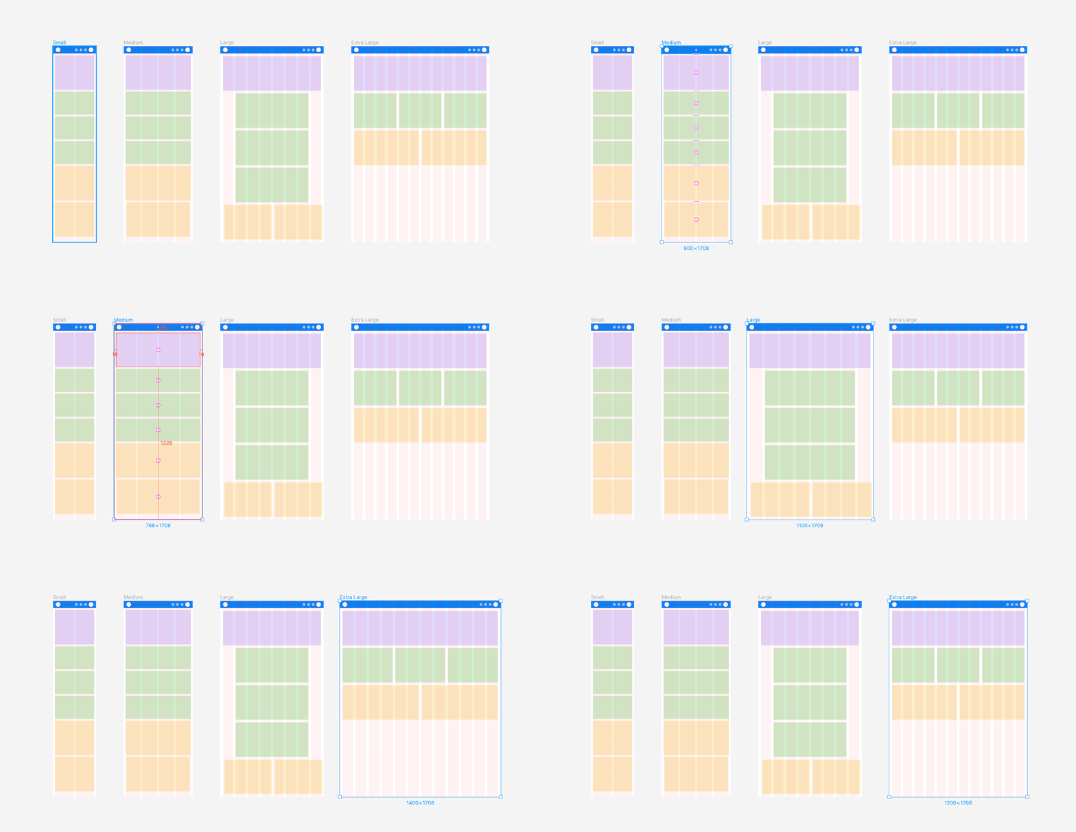
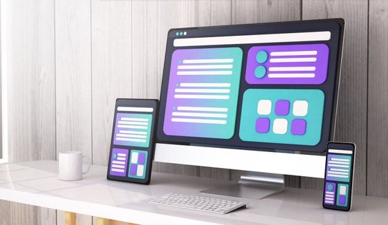
Responsive web design takes multiple screen sies into account when building a website. Mobile-first design is an approach that prioritizes designing for mobile devices first, and then scaling up to larger screens. This means that the design process starts with the mobile experience and then expands to include larger screens like tablets, laptops, and desktops.
Mobile-first design and responsive web design are related because a mobile-first approach is often the best way to ensure a website or application is responsive. By starting with the mobile experience, designers and developers can focus on creating a design that is optimized for smaller screens and more limited bandwidth. Then, as the design is scaled up to larger screens, responsive design techniques can be applied to ensure that the design adapts to different screen sizes and resolutions.
HOW CAN MOBILE-FIRST DESIGN HELP WITH WEBSITE ACCESSIBILITY?

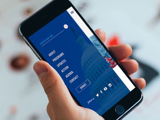
Mobile-friendly websites are optimized for smaller screens and touch-based navigation, making them more accessible to users on mobile devices. Seeing as there is an increase in mobile users across different audiences, it is important to make content legible.
Mobile-first web design can help improve website accessibility in several ways. One way of doing so is offering simplified designs. Mobile-first design prioritizes essential content and features, resulting in a simpler and more streamlined design. This can help users with cognitive disabilities, who may have difficulty processing complex information or navigating complex interfaces.
This design approach also helps with accessibility by improving page speed because it places a premium on performance optimization. This includes techniques like image optimization, code minification, and other strategies that can help improve page load times. Faster load times can help users with visual disabilities, who may rely on screen readers or other assistive technologies to access content.
The concept of responsive web design is integral in mobile-first. This design method ensures a website’s layout and content adapt to the size and orientation of the user's device. This aids accessibility standards because it can help users with visual disabilities, who may prefer or require a larger font size or different colour scheme to improve readability.
WHY IS MOBILE-FIRST DESIGN BENEFICIAL?

With more and more people accessing the internet on mobile devices, designing with a mobile-first approach ensures that a website or application is optimized for smaller screens, limited bandwidth, and slower internet speeds. This can lead to a better user experience for mobile users, who may have difficulty accessing or using websites that are designed primarily for desktop screens
Mobile-first design prioritizes essential content and features, resulting in a simpler and more streamlined design. This can help improve user engagement and reduce cognitive overload, which can be beneficial for all users, including those with disabilities.
Though mobile-first and responsive web design are related concepts, and often work together to ensure a website or application is optimized for all devices, focusing on a mobile first method ensures a better user experience for smaller screens. Mobile-first design guarantees that the design is optimized for mobile devices, while responsive web design may arbitrarily adapt to different screen sizes and resolutions.
CONCLUSION
In summary, mobile-first design is an approach to web design and development that prioritizes mobile devices and the needs of mobile users. It involves designing interfaces that are optimized for smaller screens, responsive design techniques, and considering the unique behaviours and contexts of mobile users.This design method is beneficial because it prioritizes the needs of mobile users, improves website performance and accessibility, ensures a consistent user experience across devices, considers the variety of devices that users may be using, and focuses on essential content and features.

Author

Ray
Lead UX/UI Web Designer
Ray has over 10 years experience as a Product Designer building websites, apps, Saas, and client portals from the ground up. She is passionate about user psychology and design. Her skills and interests expand into animation, video editing and graphic design. She puts 110% into every project, and aims to exceed client expectations. When she isn't at her computer you can catch her with a good book, volunteering, or on the slopes.


