

1 Hero Video and Images
Not only are we seeing more full screen images as backgrounds but we’re also seeing full screen video’s as well. Using imagery to make an impact is not a new trend but with the speed and cost of bandwidth improving and the ability to serve mobile devices more efficiently the trend is making more and more sense. In fact, websites and screens are taking advantage of HD visual assets because of the improved bandwidth and mobile optimization.
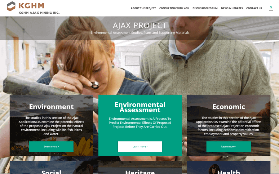
Large high resolution background graphics are part of the KGHM website design. Images are compressed using a special compression tool to get the file size down so the website loads fast. Also, the Ken Burns Effect (zooming and fading) was applied to create a sense of movement.
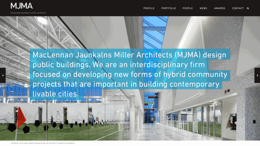
Another good example is the MacLennan Jaunkalns Miller Architects Website with hundreds of full screen images and a variety of overlays and transitions.
2 Minimalism and Flat Design
Flat design has been around for a few years and is essentially a minimal design style that focuses on usability. It includes clean, open, crisp edges, bright colours often with two-dimensional “flat” illustrations. Rather than gradients, bevels, shadows that were quickly becoming over used.
Microsoft was one of the first big examples to use this style by converting a real-life object, such as a calendar, into a tiny realistic illustration. Flat design identifies apps with simple, icon-like images that you will see across all Microsoft website and apps.
The fundamental understanding with flat design is that ornamental elements are considered clutter. If a design element has no functional purpose, then it's a distraction from user experience. As a result, flat design is considered simplistic or minimal. Ultimately it’s all about how to improve the user experience.
With flat design we see more: micro interactions, less rigid grids, more hamburger menu’s, vibrant custom illustrations and lots of Iconography.
There are plenty of lists of examples of great flat web design by searching Google. Here’s are a couple great resources to get you started:
http://www.awwwards.com/websites/flat-design/
3 Vertical Pattern and Scrolling
Since the popularity of parallax navigation vertical flow has become a welcomed trend. Long pages or even single page websites are common today because users are more comfortable scrolling vertically. Its popularity is also due to the improved SEO from a content rich page like a single page site. As a result designers are using progressive loading to manage the page load time and introducing more card style interfaces like Microsoft introduced in Windows 10.
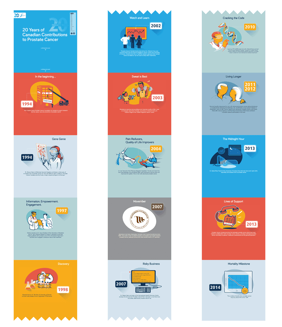
The 20 years of Prostate Cancer Canada microsite is a one page site with parallax navigation and plenty of vertical scrolling but it works really well for the story being told.
4 Typography that Makes a Statement
It used to be complicated to use non web fonts but over the past 5 years custom fonts have sprung on to the scene. The reason being we can, and without sacrificing performance, and because it can make a big difference to the design. As a result we are seeing custom fonts along with really bold unique fonts that are designed for the audience and message. Selecting typefaces for a design project is much more than just how the letters look or serifs vs sans serifs. It’s really evolved away from just readability to the overall statement. Lot's of examples out there with large impactful typography drawing all the attention.
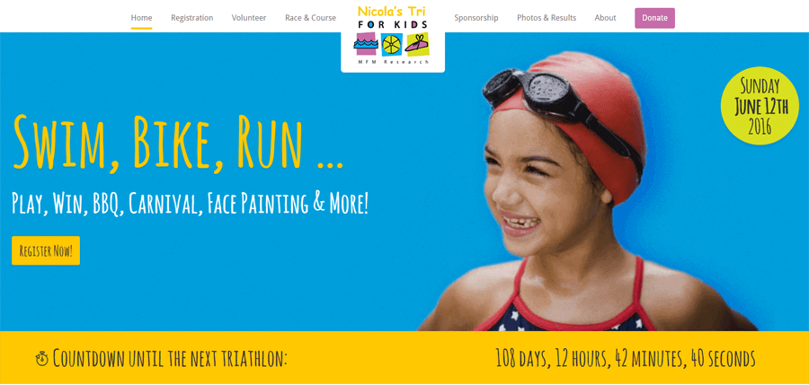
For the Nicola’s Kids Triathlon website we used children’s hand written font to align the typography with the creative. All the text is fully editable and easy to update. Also, because it’s actually text (not an image, like it used to be done) Search Engines are able to scan the text and more accurately understand what the website is about. This benefits both page load speed and SEO.
5 Subtle Loading States and micro animations
Since Flash animated sites have vanished and HTML5 and CSS3 have slipped into its place with simple motions for animated page loading, buttons, dropdown menus, sticky menus, form controls.
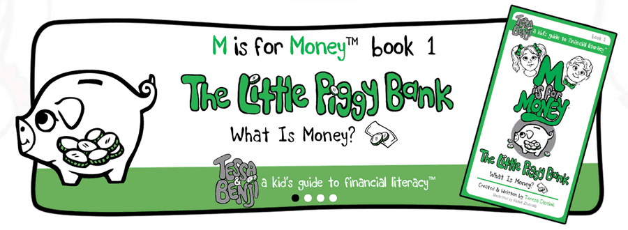
CSS transitions were used in the carousel section of our M is for Money website beyond standard slide transitions. Here the slide uses an animated transition which builds all the graphic elements into each slide to create an engaging “youth friendly” experience. Traditionally, animations like this were done using a plug-ins like Flash. CSS transitions don’t require a plug-in and download much more quickly. This needs to be seen in action.
For more about web design trends check out these references:
Tony
Director and Founder
Inorbital founder and digital solution architect with over 20 years’ experience planning and directing dynamic web presence and web applications for all types of organizations. When not directing Inorbital you can find him actively trying something completely new. You can schedule a meeting with me here