Optimize Website Images for Responsive Design: Tips for Faster Loading and Perfect Display
Managing website images for responsive websites involves optimizing images for various screen sizes and resolutions to ensure they load quickly and appear correctly across different devices. Here's are a few tips on how to manage website images for responsive website design.
Understanding Responsive Web Design
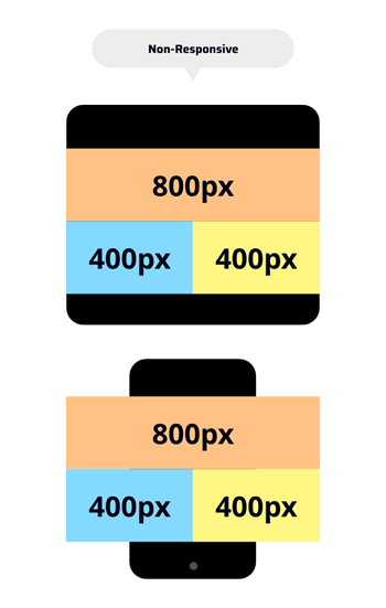
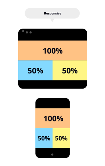
Responsive web design is an approach to building websites that ensures they look good and work well on various devices and screen sizes, such as desktop computers, laptops, tablets, and smartphones. Below you can see a simple illustrating the basic concept of responsive design. In the responsive column you see how percentages are used instead of pixels to scale images to smaller device and in the non-responsive column you can see how the pixels get cut off when the website is viewed on a smaller device. It is for this reason that when we are talking about responsive design we must not only consider the pixels of an image but more importantly understand the aspect ratio. We will get into some examples of this later on but you could look at this example as the top row being a 4:1 aspect ratio (desktop) and the second row comprising of two 2:1 (phone) containers.


Preparing Your Images
Before adding images to your website, make sure that you prepare your images by choosing the right file type, adjusting the image to the aspect ratio of the container you are adding the image to and optimizing the image by compressing it.
1. Set Image Dimensions
Make sure to set the image dimensions to match those of the image container on your website. We make this easy for editors by including the pixel dimensions next to the image upload.

While responsive coding will automatically change the size of your image to fit the entirety of the container you want to have the same aspect ratio to avoid unwanted cropping. If you do not have image editing software, there are plenty of free online image editors that will allow you to resize your images
Free photo editing software alternatives to Photoshop:
There are 3 important functions you will need to manage images: 1) resize, 2) crop and 3) save. All these features are available on the following free online software: Adobe Express and Free Online Image Editor
The table below uses some examples of common aspect ratios found in web design.
| Image Type | Image Dimensions (W x H in pixels) |
Image Aspect Ratio |
|---|---|---|
| Full height Image | 1920 x 1080 1600 x 900 |
16:9 |
| Hero Banner | 1920 x 480 1600 x 400 |
4:1 |
| Rectangle | 1080 x 720 600 x 400 300 x 200 |
3:2 |
| Rectangle | 800 x 400 400 x 200 200 x 100 |
2:1 |
| Rectangle | 640 x 480 | 4:3 |
| Square | 1080 x 1080 400 x 400 100 x 100 |
1:1 |
2. Choose the correct file format for your images
JPEG is best for photographs and images with many colours, while PNG is best for images with transparency or sharp edges. SVG is ideal for icons and simple graphics that need to scale without losing quality.
3. Always Optimize Your Images
Once you have set your image to right dimensions and have saved them as the right file type you will need to optimize for the web. Optimization is simply reducing the file size of images without compromising quality. Generaly when you upload the orginal photo file its can be several megabytes in size. Uploading these huge images to your website will make page loading much slower. You can use the free online tools like TinyPNG or Image Recycle to compress images for web. With these free tools you can usually get image files to be 50 to 60% smaller without a noticeable difference in quality.
Consider Accessibility and SEO
File Names
Selecting appropriate file names for your images can positively impact your page's SEO ranking for image search results. Ensure that the file name includes relevant and descriptive keywords, avoiding the use of underscores.
When considering accessibility, we need to consider the fact that screen readers cannot read images so they are limited to interpreting images by the image file name as well as the alt tags. It is for this reason that image buttons fail accessibility standards.
Here are some examples of how to optimize your image and alt tags for screen readers:
Image name: “Sample_Image.png” is not as good as “Woman-holding-baby.jpg”
Avoid using underscores, instead use hyphens and try to describe what the image is about.
ALT Tags
Accurate ALT tags assist search engines to understand the content of your images, aiding in the search indexing of your sites content. Additionally, ALT tags are utilized by screen readers to describe images to visually impaired users, which required to be accessible. It's crucial to fill in the ALT tag field where you upload the image and describe images naturally without keyword stuffing. Fill out the field how you would describe the image to someone unable to see it. Ie Alt tag: “Sample_Image.png” is not as good as “Woman Holding Baby”
Avoid using the file name as the alt tag. Also consider the fact that website crawlers read the same information as screen readers so if you use keywords that are part of your SEO strategy in the image names and ALT tags you will be both accessible and better optimized for search engines.

Never Embed Text in an Image!
Here are the 4 most important reasons embedded text in images should be avoided:
- It's not accessible because screen readers used by visually impaired individuals cannot interpret words embedded within images.
- Search engines primarily index text content, so words embedded within images is not easily readable by search engines and therefore ignored.
- Text embedded within images doesn't scale well across different devices and screen sizes. It becomes very hard to read since it shrinks on a phone. (show example)
- If text needs to be updated or corrected, it requires editing the image itself, which can only be done using an image editor like Photoshop (or the free tools listed above) and then reloading the image.
Summary
Images play an important role in optimizing your website's performance and engaging your audience. We hope that you have found these image management tips helpful. If you have any questions about anything we have covered in this article or want to schedule a call, please don't hesitate to contact us.

Alex
Senior Project Manager
Alex Treen is the Senior Project Manager at Inorbital, specializing in member-based solutions. Alex oversees project lifecycles, ensuring timely and budget-conscious delivery of dynamic websites for a diverse clientele. He has over 10 years of experience managing digital projects with a background in Psychology and Web Design.

