Creating a contemporary online brand for Ontario's doctors and surgeons
The College of Physicians and Surgeons of Ontario is an association that regulates the practice of medicine in Ontario by setting qualification requirements and standards of medical practice and professionalism for doctors.
![]()
Objectives
The CPSO membership website was dated. The objective of this project was to design and build a completely new website that addressed content, function and design issues, based on research that identified user profiles and their needs.
Challenges
The CPSO website had thousands of pages, a search that did not function and a menu system that was difficult to use. Frequently, users had to resort to Googling information on the site to find what they are looking for. We saw the opportunity for CPSO revamp their site architecture (site map and information architecture) and strategize a new user experience, that addressed content creation, navigation and design.
Scope of Work
Our Approach
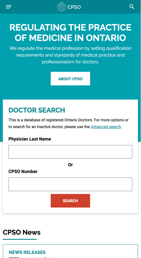
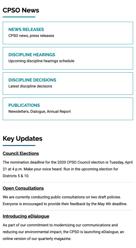
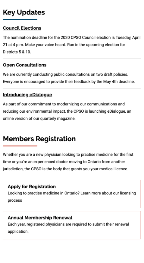
Our primary goal in the rebuild of the CPSO membership website was to incorporate the research findings into a highly functional website. The site needed a practical approach to ensure efficient access to vast amounts of content. We ensured a strong user experience by creating a clean, streamlined architecture and design based on user goals.
Another major goal of the project was to improve search functionality. We wanted to ensure this function was contained within the website so that users no longer needed to rely on browser searches to find information.
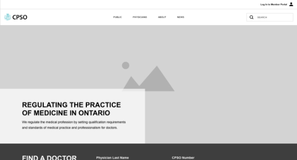
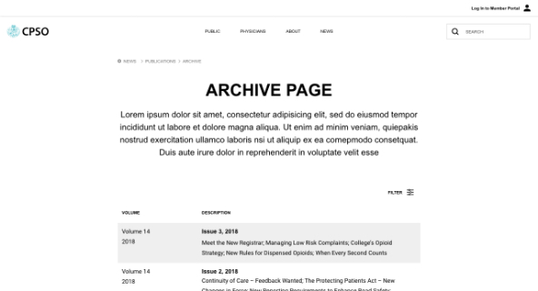
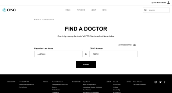
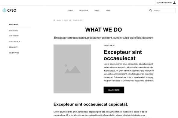
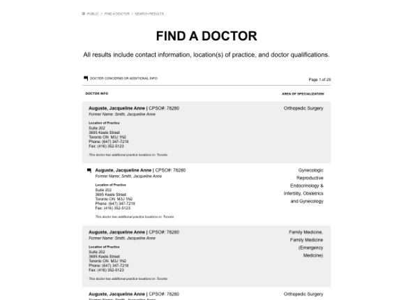
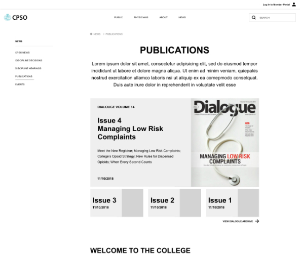
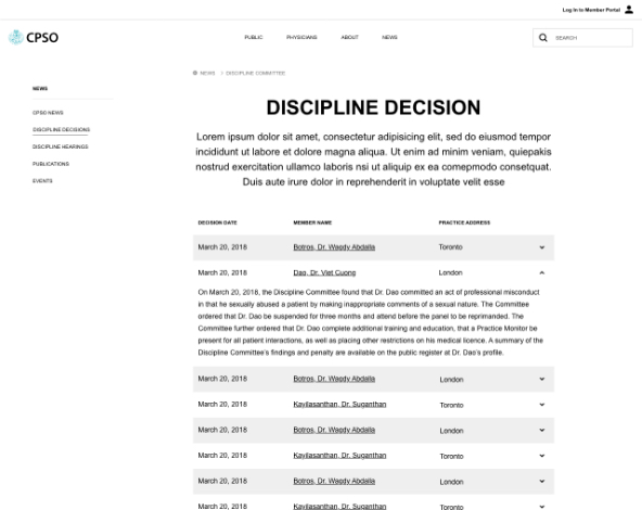
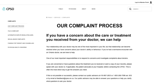

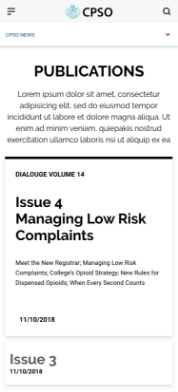
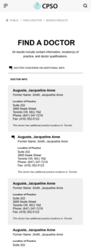
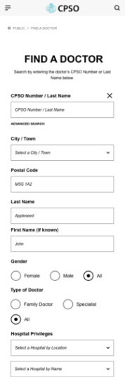

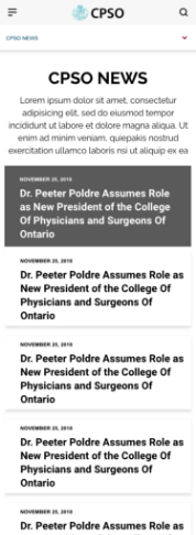
We started by creating wireframes for over 15 templated pages to ensure that we addressed all the current and future needs of CPSO. By creating high fidelity wireframes, we were able to create a strong base for the site design. Testing user journeys in the wireframing stage allowed us to catch any problems early and make the necessary changes.
The CPSO design passes AA accessibility standards with proper contrast in colours and legible font sizes.
Logo Refresh
Our first design challenge was to update the CPSO logo for use in digital applications. The existing logo used a serif font and an intricate crest design that was becoming illegible in responsive design applications.
Before

After
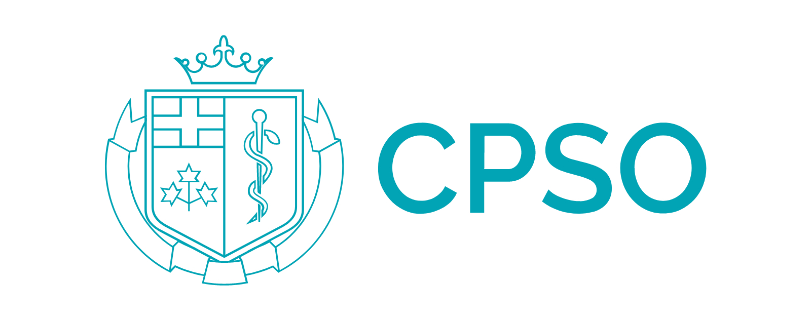
The new logo is a simplified version of the original, with a more contemporary digital focus. The updated logo was an evolution that maintained the equity of the CPSO brand while making it more adaptable for web and digital use.
The evolved logo informed the visual style of site and the CPSO visual brand overall. The site’s clean design with ample white space ensures the focus is on the content of the site. The CPSO design passes AA accessibility standards with proper contrast in colours and legible font sizes.

Three considerations informed our design approach. Firstly, the CPSO brand is well-recognized by members and we needed to ensure the brand was reinforced in the new design. Secondly, the design had to meet accessibility standards. Finally, the content rich site required a clean and efficient design approach.
Results
CPSO is extremely happy with the website we built them. Members and users of the new CPSO website are also delighted with all the improvements and find-ability. The smart search functionality, clean, contemporary design, and improved performance of the membership website combined to create an exceptional user experience.
Project Details
CPSO had been using Kentico content management system but was based on the older Portal version. We proposed Kentico MVC for the new association website, and content editors were impressed with how easy Kentico MVC made content editing.